1. Explore the color wheel at https://www.canva.com/colors/color-wheel/ and define the following using writing for the web techniques discussed earlier:
Color wheel: explored
- Complementary colors
Colors on the opposite side of the wheel from one another that portray high contrast.
- Monochromatic
Two colors similar to one another, in different shades.
- Analogous
Three colors similar to one another, in different hues.
- Triadic
Three colors all evenly spaced on the wheel that show high contrast.
- Tetradic
Four colors all evenly spaced on the wheel that provide complex contrast.
- Primary, secondary and tertiary colors
In the RGB wheel, the primary colors are red, green, and blue, the secondaries, made by mixing the primaries, are cyan, magenta, and yellow, and the tertiaries, made by further mixing, are orange, chartreuse green, spring green, azure, violet, and rose.
On the other hand, the primary colors of the RYB wheel are red, yellow, and blue, the secondaries are purple, orange, and green, and the tertiaries are red-orange, yellow-orange, yellow-green, blue-green, blue-violet, and red-violet.
- Warm colors
Warm colors invoke a sense of temperature, and many warm things use warm colors. Red, orange, and yellow are usually seen as the warmest.
- Shades, tints and tones
Adding white to a color adjusts the tint, adding grey to a color adjusts the shade, and adding black to a color adjusts the tone.
- Hue, saturation and luminance
Hue is typically the base color of light, with saturation being the intensity, and luminance being the brightness.
2. Pick your favorite color. Identify complementary colors, monochromatic, analogous and triadic colors of your favorite color. Write down the hexadecimal numbers or take screenshots if needed.
My favorite color is #000077. Its complementary color is #777700, its analogous colors are #3b0077 and #003c77, and its triadic colors are #770000 and #007700.
3. Visit http://paletton.com to learn about color pallets. Identify three color pallets that you like the most. Choose one monochromatic, adjacent and triad colors.
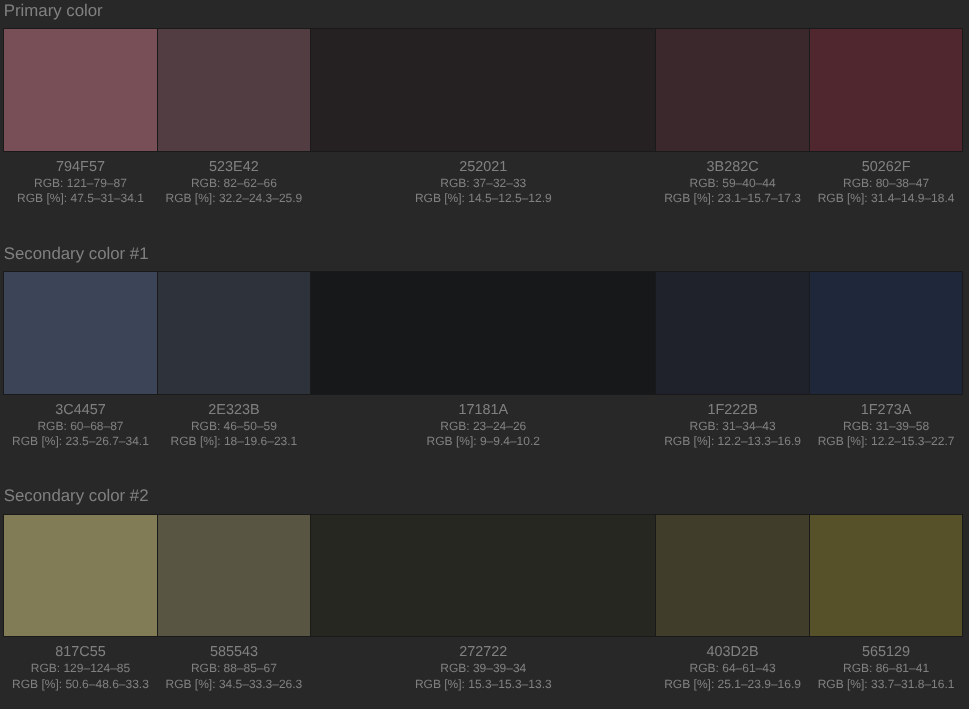
I liked Greyish darkest, Dark pastel, and Dark neon, with purple being my base for selecting my favorite presets.
Monochromatic:
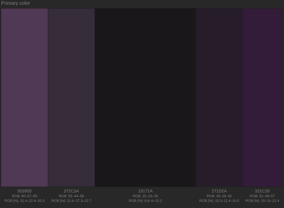
Adjacent:
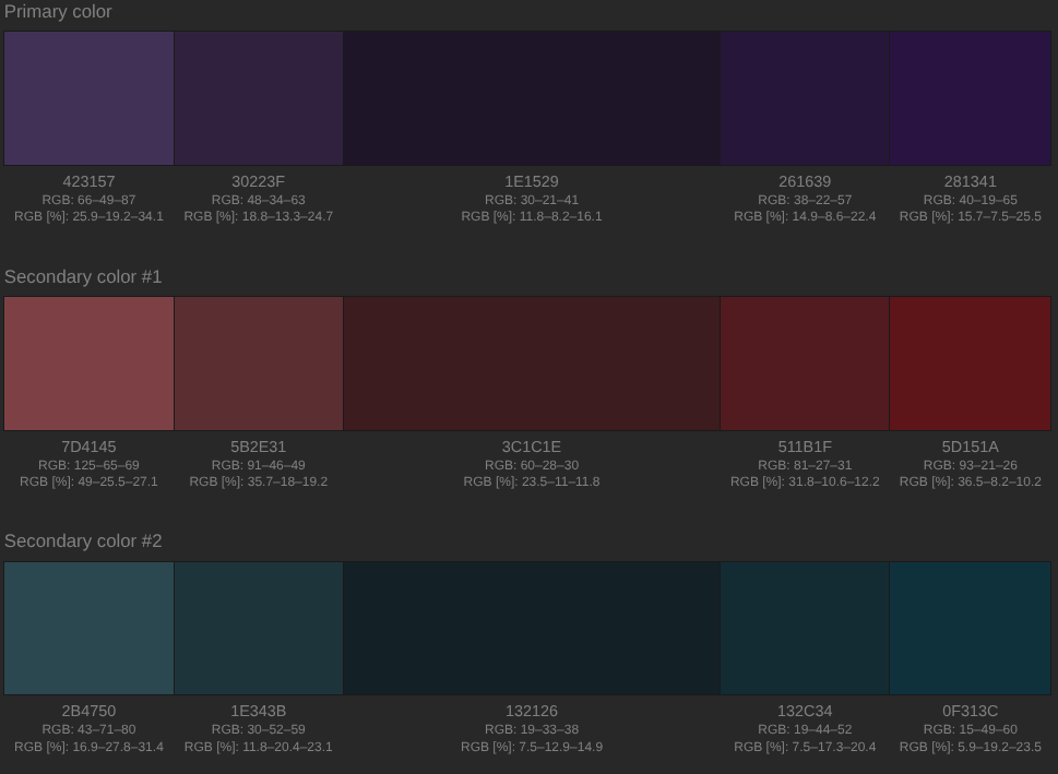
Triad:
4-5. Apply the chosen color pallets to web pages. Click Examples, Page layout (White page, Dark page, Positive page, Negative page). Take screenshot(s) of the Page Layouts under Examples for each color palette.


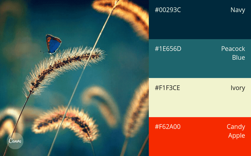
6. Visit https://www.canva.com/learn/100-color-combinations/ and identify three color combinations that you like and explain your reasons using chunking of text.
Timeless & Nautical: navy, peacock blue, ivory, candy apple - These are some of my favorite colors.
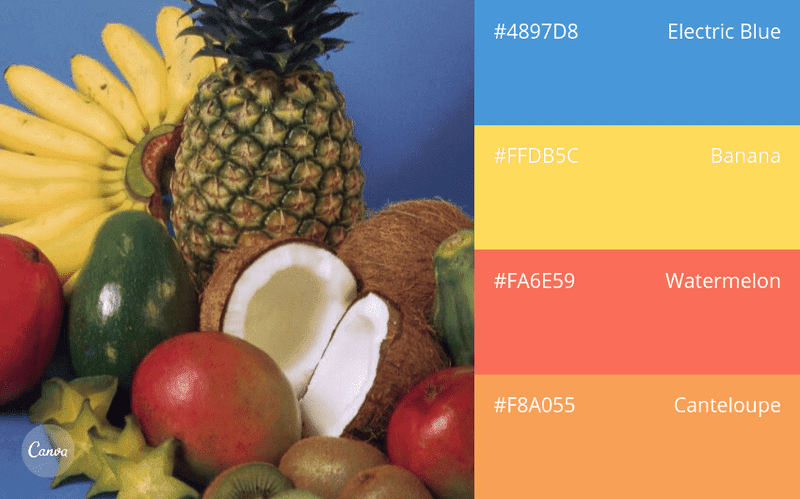
Fun & Tropical: electric blue, banana, watermelon, cantaloupe - This one made me hungry.
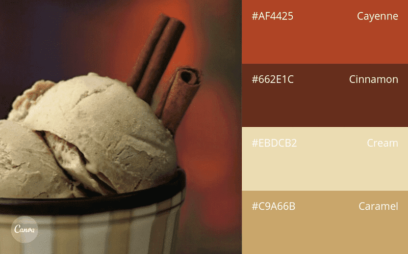
Spicy Neutrals: cayenne, cinnamon, cream, caramel - This one made me really hungry.
7. Find on your own two additional resources related to writing for the web, and color as a web design tool.
https://www.umaryland.edu/cpa/website-manual/prepare/web-writing/ - Though it mentions writing articles exclusively for their own site at the top, all of the information inside is compatible everywhere else.
https://www.canva.com/learn/website-color-schemes/ - I double checked to make sure that this wasn't an already explored Canva link.